made with react.js
651
Description
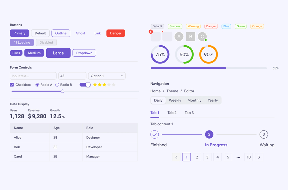
UI Component Library
"Tiny UI is a set of UI components and widgets built on React.js, which mainly serves some middle and back end products."
- 80+ components — buttons, forms, data display, navigation, feedback, and more
- Visual Theme Editor — 20+ built-in presets inspired by popular design systems; customise colours, typography, and spacing in real time without writing code
- Dark mode — built-in light/dark themes with system preference detection and a useTheme hook
- TypeScript — written in strict TypeScript with complete type definitions
- Accessible — follows WAI-ARIA standards with keyboard navigation support
- Lightweight — tree-shakeable ESM/CJS builds; styles auto-import alongside components
- i18n — English and Chinese built in
-

- 📊 Statistics
- ✏️ Request update
Social Media Links
Paragon
Design System for Learning Applications
Bento
Open-source Design System
3.234
Sentry for React
React Application Monitoring
💙 Sponsored by Friends
grommet
UI Framework / Design System
Wix Style React
Component library by Wix
2.115
Ariakit
Toolkit for Accessible UIs