made with react.js
Description
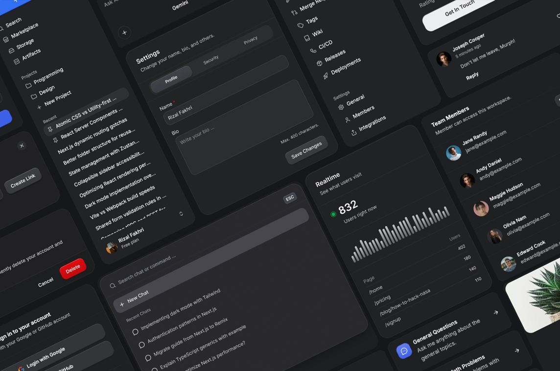
Component Collection
"Selia is an opinionated UI library for React, built on top of Tailwind CSS and Base UI.
It can be used as-is, or treated as a starting point for building your own design system. It is customizable by design, but opinionated by default, so common interfaces feel structured and cohesive without constant tweaking.
Selia (pronounced seh-lee-uh) is an Indonesian word that means teratur, rapi; elok; apik. It describes something that is well-arranged and visually pleasing.
As the name implies, Selia emphasizes order and cohesion. Components are designed to look good together by default, reducing the need for extra configuration or utility classes, while still allowing adjustments when necessary."
Creator

Social Media Links
Atomik Color
Accessible Color Picker
629
React MonacoEditor
MonacoEditor Component
465
Sentry for React
React Application Monitoring
💙 Sponsored by Friends

We’re hosting on Digital Ocean! 💙 Try it today and get a free $100 credit.
Hightable
Virtualized Table Component
165
React Materialize
Wrapper for Materialize
7.066